Not sure if you need a mobile website? Test your website using this FREE Preview tool and see how it would look on a mobile device. Test Your Site
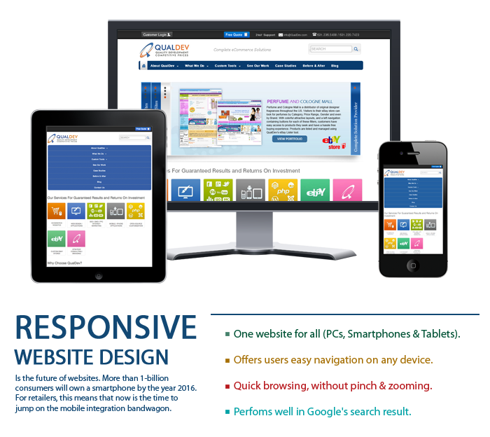
What is Responsive Web Design
Ethan Marcotte introduced the world to the
concept that
allows for websites to be designed for viewing on any
device i.e. desktops, laptops, mobiles or tablets
without resorting to developing individual pages
suitable for viewing on each device – or losing the
consistency of the feel and look of the original content
and visuals. In other words, websites created using
other concepts may look different on various gadgets
whereas, those created using the concept of responsive
web design would maintain their consistency across all
the devices.
Why RWD? The Rationale Fueling The Concept
The problem and huge expenses of creating separate pages
or entire websites for each type of device lead to the
development of this concept. With new advanced devices
hitting the market daily, and consumers turning to
feature rich smart phones and tablets to surf the net
and socialize, developers were hard pressed trying to
keep pace with developing websites that would ensure
that businesses were well exposed on all these new
devices. The Responsive Web Design Concept is an
amalgamation of technologies and ideas and not just a
single platform.
Elements of Responsive Web Design
1.) CSS3 media queries, which adapt the layout to the
viewing environment using fluid proportion-based grids
and flexible images
2.) Media queries facilitate designers, allowing the use of various CSS style rules depending upon the device
3.) With the exploitation of the fluid grid concept, the page element sizing can be in relative units like percentages or EMs.
Benefits Of This Design
Designing
websites based on the responsive web design concept is
not only helps web designers save on time but also
proves to be a blessing for end consumers in the
following ways to name a few:
1.) Less expensive as it only requires the maintenance of a single code base
2.) Helps merchants improve their SEO
3.) Offers a single URL for all devices and a consistent experience across all devices
4.) Significant boost to popularity as a huge volume of web traffic comes from mobile devices
5.)Provides easier navigation and readability for users irrespective of the device being used

Deficiencies Of The Concept
Deficiencies in the concept mainly stem from the fact
that it is relatively new and requires a bit of skill to
pull of creating a winning product. Remedies to
shortcomings like these below are emerging with each
passing day:
1.) One of the challenges comes in the form of customization. If a designer wants to create a feel of native application, it would be very difficult to get desktop-website feel on larger screens.
2.) Designing and developing the initial structure based on this concept takes time as the teams involved need to consider and plan the structure of the site so that nothing gets overlooked or left out.
Responsive Web Design ProvidesHowever, once a site is ready, it is sure to boost business way ahead of the present curve. The current shortcomings exist only because this concept is in its fledgling stage so knowledge and awareness is limited. Hence, responsive web design is indeed yet another milestone in the world of web designing and development. According to the experts of the industry, the concept of responsive web design essentially represents a fundamental shift in the way in which designers across the world would build websites for decades to come.
Responsive web design is an emerging concept in the web design and development world. However, as the concept is an elixir distilled from practices that have repeatedly borne fruit – it is set to revolutionize web development and provide assured returns on investments to online business globally.